According to Data Site ‘Built With’, 794,458 stores are -currently using the flagship Dwan Theme. Arguably the most the popular Free shopify theme for the right reasons….
The problem with using free Shopify themes is that you are going to have thousands of stores all looking the same. Pretty hard to stand out.
There is however a way you can stand out from the sea of stores using staple themes like Dawn, Crave… You can sprinkle in custom features without:
– Knowing how to code
– Wasting a lot of time, takes 4 minutes
– Slowing down your ecommerce store
– Spending money duh!
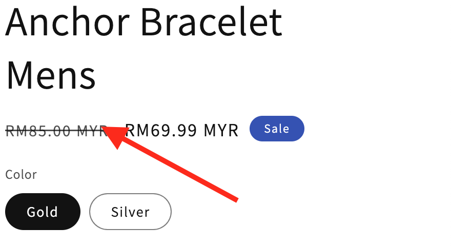
Here’s is how you can uniquely display a customer’s savings, totally different from the typical price strike thriugh
This is considered industry standard. Everyone’s store looks like this
Remember all you need is to locate files and the product template and paste the code. Nothing technical.
Right away, head over to the customiser and select the product page you need to make changes to..
– Add a ‘custom liquid section’
– Reference the product object
Here’s how to reference the product object in shop
Currency(USD, EUR, MYR…) Value Savings
– Paste this code in the ‘Custom Liquid’ block
<p> You save {{ product.compare_at_price | minus: product.price | money }} </p>Code here above gets you these results(see image below)
You can add and ‘if’ condition to ONLY display savings if a product actually has a discount applied. Else normal price shows. Code right down below:
{%- if product.compare_at_price > product.price -%}

<p>YOU SAVE {{ product.compare_at_price | minus: product.price | money }}</p>

{%- endif -%}
Now if you want to display savings percentage a customer gets, here is the code and what it looks like on the product page:
{%- if product.compare_at_price > product.price -%}

<p>YOU SAVE {{ product.compare_at_price | minus: product.price | money | times: 100 | divided_by: product.compare_at_price }}</p>

{%- endif -%}
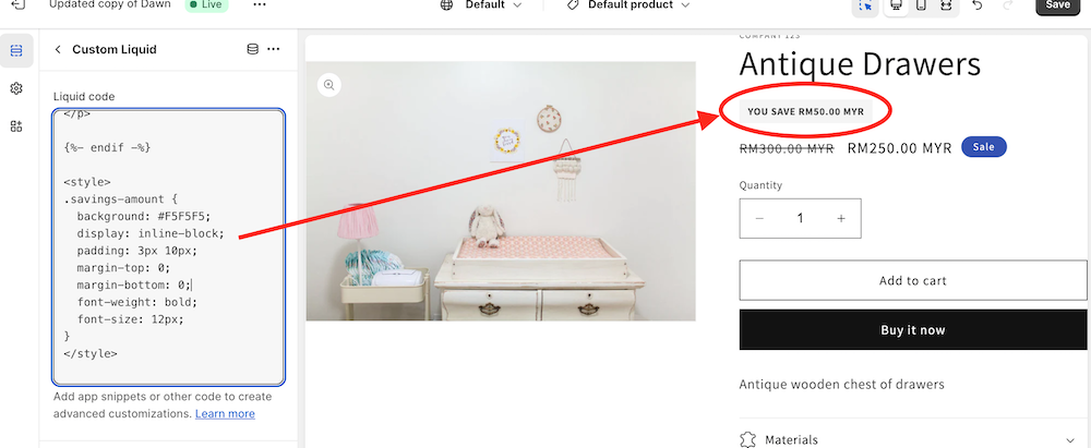
Throw some custom styles on to these changes. Remember we are trying to stand out a little bit? Code here below…
{%- if product.compare_at_price > product.price -%}

<p class="savings-amount">YOU SAVE {{ product.compare_at_price | minus: product.price | money }}</p>

{%- endif -%}

<style>
.savings-amount {
  background: #F5F5F5;
  display: inline-block;
  padding: 3px 10px;
  margin-top: 0;
  margin-bottom: 0;
  font-weight: bold;
  font-size: 12px;
}
</style>
Code above gets you the Grey tone as illustrated below:
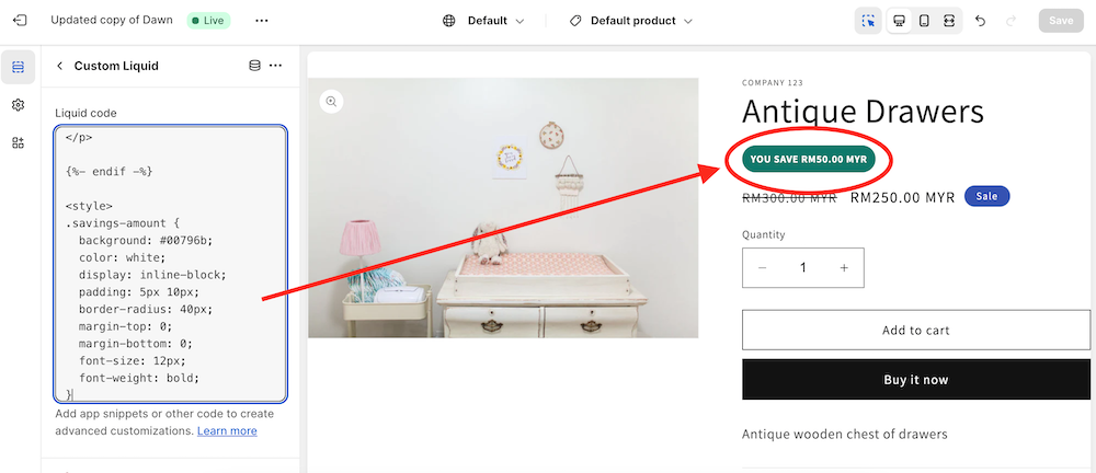
Not feeling the Grey Scale? Try this Green Color
{%- if product.compare_at_price > product.price -%}

<p class="savings-amount">YOU SAVE {{ product.compare_at_price | minus: product.price | money }}</p>

{%- endif -%}

<style>
.savings-amount {
  background: #00796b;
  color: white;
  display: inline-block;
  padding: 5px 10px;
  border-radius: 40px;
  margin-top: 0;
  margin-bottom: 0;
  font-size: 12px;
  font-weight: bold;
}
</style>
Little tutorial to help show a customer how much they are saving. Simple and straight forward…
Now if you feel overwhelmed, simply send me an email with subject of your problem and I’ll sort it out for you.
Email: kadduf6@gmail.com

